Thursday, May 7, 2015

The Best Laid Plans...

Coastal Colors  ©Theresa Grillo Laird - 9x15 oil
see it here

Have you ever found yourself in a place where all your goals and plans for the year, so carefully formulated in January, just go to pieces? Elder care issues have brought me far from home and studio for much longer than expected. I can only very briefly leave the house, so even 2 hours for plein air painting is out.

The gears move very slowly in a day of the very elderly. Almost as soon as the duties belonging to one segment of the day have been completed, it's time to start the duties of the next segment. In the bits of time I can snatch between tasks, I've been focusing on things I ordinarily don't use my art time for. Not far from here are farmers fields in new spring green and flowering trees that I can't stop to paint, but from the house windows I see suburban backyards and small homes with roof lines that interrupt the view. Even this limited vista provides shapes that allow me to do small practice pieces of value and color. A block of western sky hemmed in by roofs and tree tops, gives me clouds to practice with daily. These quick studies are no more worth showing off than a musician's scales would be worth hearing on stage, but they aren't time wasted.

I've been using my time too studying the work of artists I like. It's interesting to me to find out what palette of colors artists use.

Beach House © Theresa Grillo Laird - 9x12 Oil
see it Here

My own palette has changed over time. After years of painting with a palette of about 12 or 14 colors, I narrowed it to 6 or 8 colors about 10 years ago. For the past year and a half, I narrowed it further to just Ultramarine Blue, Cadmium Lemon and Permanent Red. The paintings in this post were painted with that palette. I've started adding back in a few of my favorites like a reddish brown and a muted orange-red. Both of these colors are useful to vary green mixtures.
You can often determine what the palette of a contemporary artist is by looking at their workshop supply list. Palettes of past masters are a bit harder to research especially when colors are mentioned that aren't in use anymore. I have a notebook where I keep the names and palettes of artists I like. 

Finally, this time of exile from my beach and my studio, has given me time to think about where I really want to go and how I might get there. I've been discarding the routes that take me from my own personal path, and fine tuning what is left.
Who knows? Maybe my best laid plans of January really weren't what I most needed.

Water Rising © Theresa Grillo Laird - 12x16 Oil
see it Here

Friday, April 17, 2015

The Plein Air Convention- I swear I'll make it next year!

Sunshine Through the Oaks - Jack Wilkinson Smith

I wish I could be with all the artists enjoying the Plein Air Convention out in California, but I can't. Life's challenges have landed me far from home and studio without possibility of travel. So I'm consoling myself this week, studying the works of past California Impressionists.

Every time I look at early plein air paintings, I wonder what it is that makes them look so different from today's. I don't think it's the expertise. There are many very accomplished plein air painters today turning out visually stunning work. But these older paintings always make me wish I could wander into them and experience for myself what these artists saw and felt that made them so able to capture a sense of place and time with such depth. I can feel the spirit of the places they portrayed. Could it just be that they didn't hurry the piece? Or is it that the sense of community among artists they enjoyed,was especially conducive to their creative genius?

I have a thing about California Impressionism,  - the colors, the light, the dense pieces of paint so different from the more diffuse shapes of French Impressionism, the spiritually of it, the love for the land, the guileless honesty of the works.There are so many artists I could focus on, but these three works are by Jack Wilkinson Smith. His paintings of surf and rocks, full of force and vitality immediately caught my attention when I first came upon them in an art book.His home base was in southern California but he traveled throughout California painting all kinds of terrain.
I studied this next one to see what I like about it.

Deserted Corral - Jack Wilkinson Smith
All of today's plein air masters talk about the need to break up a shape into varying color temperatures.But it seems to my eye that this work, like others from this era, has a more complex pattern of subtle temperature and value changes. It leaves the viewer with more to look at on the canvas surface, without interfering with the integrity of the whole. The type of air hanging over the day is also really well depicted. Look at the difference from front to back of the painting. Notice too the way the color scheme is basically two complementaries- red and green. There are bright touches of color where a more timid painter would never place them, like on the outlines of the peaks on the left. There's plenty of variety in the colors but it's very harmonious.

Winter's Mantle - Jack Wilkinson Smith 
Here's a snow scene with the complementary color scheme of blue and orange. Even the greens in it are turned towards orange or blue.Look at how the singe bright spots of color, as well as the zig zag lines, bring the eye right back into the mountain peak.There's a single spot of bright orange in the middle of dull orange on the bush to the right. Above and slightly to the left, the tree top and tree trunk are lit up - the only lit up tree trunk in the whole scene - Next there's a spot of bright green in the tree tops in the center back, and finally the sun lit plane of snow on the peak. The energy of the brushstrokes fills the whole painting with a feeling of movement and nature's  sounds.


If your tax refund will put a bit of spare change in your pocket, all three of these paintings are available at Bonhams spring auction of California and Western Paintings on April 28th.

Friday, March 20, 2015

Who Are You Painting For?

Golden Hour -©T Grillo Laird -  oil on canvas - 24x48
click here for website


I entered this painting in a competition for a national exhibit. It did not get in. I had the chance to submit two paintings for consideration, but only entered the one. I had a second painting ready but didn't enter it because I thought the first was better. Not long after, I posted both paintings on Facebook. The painting I didn't enter, quickly racked up 260 "likes" and sold the next day. The one I entered in the competition, the one I thought was better, received 105 likes.

So, what does this tell me? Are competition entries more likely to be successful when they have greater popular appeal? Was it self defeating to enter only one? Am I a poor judge of my own work?? 

Then I started to think. Who am I really painting for? Whether for galleries, judges, or the writers of articles who can make an artist's reputation, I'd have to tailor the work- even if only subconsciously- to what I think would meet their expectations. What then happens to exploration and the quest to strive for the highest level and the excitement of discovery that comes with freedom from anyone's expectations- including my own?

I recently attended a workshop where one of the participants plied the instructor with questions about various marketing tactics. He listened, then quietly said "If the work is good, people will take notice." In the silence that followed, I could see my way forward.

Sunday, March 1, 2015

Painting From Photos

Though 99% of my work is painted outdoors, there are times when painting on site is impossible. Traveling with non painters or with people who are anxious to get from point A to point B in the fastest way possible, usually means I need to take a photo if I want to preserve an image I wanted to paint. It amazes me that such travelers fail to realize what unexpected treasures they miss in their single minded focus!

Here's a 24x36 I started from a photo during this past week. Though I have paintings waiting that were started on the beach and need  to be finished, wind, rain and cold kept me out of the dunes all week. This one still has a long way to go.


And here's the photo reference I started from.


I knew I wanted a yellow sky reflecting into the water, yet I didn't want anything in the background to overpower the boats. I'll see how it all evolves and if I succeed with it.

Photos can be an exciting resource when used as a jumping off point. They're also useful for unfamiliar details. But copying a photo verbatim as a standard practice, cheats the painter of the experience of seeing all the subtle color shifts and experiencing all the intangibles that find their way into a painting done on site. 

Sunday, February 15, 2015

Staying True

Footprints ©T Grillo Laird - oil 18x24 -sold

Here is a painting I completed a few weeks ago. It's popularity since I posted it, has surprised me. The first surprise was when it sold the morning after I posted it. I then posted it on an artist's site and was taken by surprise again by how well it has been received. 

I tried to analyze it. Is it the title? The colors? The mood? The paint? Then it occurred to me that in painting it, I held true to the working method that for me seems to produce results closest to what I was aiming for. Ignoring all conventional wisdom and restrictive rules about how outdoor painting is practiced, I just painted in the way I've done outdoor paintings for the past 20 years. I took my 18x24 canvas out to the dunes near my house and looked and painted. When the light changed, I packed up and took it out again the next day. And the day after that. One day I didn't like the results and scraped it all down just to begin again on my next session in the dunes. When I was finished I took it home and studied it. I made a few adjustments where a line was too strong or a spot in the background wasn't receding enough. I studied it some more then called it done. Of course no painting is ever done. It's just brought to a point where it can be left alone.

I do enjoy painting those loose sketchy paintings that I start and finish in one two hour session on site. The results are often fresh and unexpected, but most of the time I'm left wishing I had developed an idea a bit further.

I think that when I manage to shut out all the clamorous voices telling me how I must paint, and I listen to my own inner voice, I am again the happy serene painter I started out as when I was a young child.

Sunday, February 1, 2015

What Is the Point ?

Shoreline Curve - ©T Grillo Laird - 14x18 oil
click here for inquires

In the four years that the Bagdad, Florida Annual Paintout has been going on, I've participated three times. In the first year of the fledgling event, I received third place for Bagdad Boathouse. My goal that day had been merely to finish within the allotted 3 hours, since I was participating in my first ever paint-out. Naturally, I was delighted with the win.

This past November, in the re-named re-vamped Bagdad/Milton Plein Air Paint-out, I won second place for Shoreline Curve. I've learned to paint faster in the years between the two events. I can now finish a plein air painting in about two hours. Of course a very valid argument can be made that speed often has little to do with quality, but that's a debate for another day.

Though I was pleased with the win, I was not happy with the painting. I knew that a tree trunk I had painted into the scene was not working, and I was out of time to fix it. I prayed that the painting would not sell during the month long exhibition, and fortunately it didn't.

The offending trunk has been painted out and the painting is much better for it. The moral of this little tale is to always remember to not stupidly paint something in just because it's there. Edit, edit, and edit has to be the first rule of painting outdoors- And indoors for that matter.

May I never fall into the trap of refusing, just for the sake of "plein air purity", to alter a painting that isn't working. When they work, and many do, I'm grateful. When they don't, I'll continue to feel entirely free to fix them. 

Sunday, January 25, 2015

A Reconsidered View of Marketing and Branding

The View From the Fort -©T Grillo Laird - 24x48 oil
contact here for information
During the past two months or so while I was away tending to family issues, I spent very little time on Facebook. My hands were full and my mind was occupied with solving the problems at hand. But I did have time to think about where I was going with my painting. I had just come from a very productive landscape painting workshop that has given me a blueprint for the direction of the work itself. The more I focused on this blueprint, the more I realized that I don't want to spent my finite resources on the overly time consuming process of marketing and branding - the two hot buzz words right now. I came to the conclusion that I'd always had before I started reading and investing in the flood of marketing advice now available:
I do not want to become a master marketer of mediocre work!

Like many who have succeeded quite nicely at establishing a large and loyal following, I'm sure I could succeed at the branding game too with the right actions. I had to have this recent forced vacation from these efforts to remember my north star. I intend to focus without distraction on the improving of the work itself. Only when I've seen tangible results of this focus, will I potion off some of my time again for the effort of making my work known. 

So, if you see less of me on Facebook and on the many painting sites where I post on Facebook, I am more not less busy in my studio and on site working on my craft.


Sunday, January 18, 2015

Plein Air in the Grey North

Chesapeake Fall - 9x12 oil - © T Grillo Laird
click here to purchase


It's been a long time since I've painted the fall season up north. It almost felt like I'd never done it, I've become so used to the colors and terrain of the Florida Gulf Coast.

This little piece was painted in Maryland at the studio of Hai-Ou Hou. The landscape, flatter than my coastal home was a challenge and I had to take my plein air piece and work it further in my studio to get anything close to acceptable. Like southern New Jersey which was my next stop for the following 7 weeks, the weather was consistently gray. I didn't mind the grey skies- they always set off fall color beautifully. But the lack of light became difficult to deal with. I'm happy to be back in my Florida sunshine!

Monday, January 12, 2015

At the Walter Anderson Museum

Waiting - 6x8 oil sold
Ten days ago, while on the way to Austin, we stopped for a couple of hours at the Walter Anderson Museum in Ocean Springs Mississippi. Walter Anderson and two of his brothers were artists during the mid 1900's. Click here for a short bio about him from the museum's website.
When you step into the museum, the first thing you see is a 20 minute film clip about Anderson's life. Time was too short to watch more than a few minutes of it. We chose to look around the museum instead. I knew of Anderson but hadn't studied his work. The one or two pieces I'd seen looked like folk art and primitive styles have never appealed to me. But the more I looked, the more I wanted to look. Some works were just pencil sketches, Some were watercolor and many were lino-cut prints. Most were of shore animals and coastal landscapes.
The expressiveness of Anderson's line surprised me. Rather than the naive portrayals that I expected, each work had exactly the kind of line or shape that perfectly described the character of what he drew. His cats were fluid, slinky and intent. Each type of bird was drawn with long delicate line or chunky marks of pigment according to it's character or way of moving. Plants with thick tropical stalks were drawn with strong unbending marks and petals of flowers with soft curving lines. His landscapes of coastal shoreline and live oak trees looked unlike any I've seen yet they accurately expressed the humid, moss draped environment of the Gulf Coast.
Here are a few examples for you to enjoy.


Here's one I especially like. The different densities of black and the fierce rectangular eyes and thick beaks amid a flurry of wings, is foreboding and beautiful at the same time.


He used a lot of red and purple in his paintings.


Look how this frog is alive with motion!

Sunday, January 4, 2015

Austin Again

Afternoon reflections on Ladybird Lake in Austin 

This Tuesday marks eight weeks of travels since I've been home. These past few days spent visiting family in Austin, top off a late fall season of tending to family duties, enjoying holiday visits and attending my first workshop. Tomorrow at dawn we'll start the long drive back to Pensacola.

January promises to be a busy month. I'm teaching three painting classes at Pensacola State College's Continuing Ed. It's not too late to get in on these. Click here to register. Another gallery has called with the offer to join their artists. Read my blog next week for more about this. And there's an art fair in March to get ready for.

But for now I'm enjoying the remaining few hours of my Austin visit. Each time I visit the Austin area, I like it better. It's true, it was brutally hot when I was here last June, but I got some good work done despite the heat. Already we're planning an early fall camping trip for 2015.I can't wait to paint the colors of early fall! 

But for now, it will be good to get back to work in my studio. I'm fired up with plans for 2015! No resolutions. Just a crystal clear North Star. Stay tuned! 

On the newly constructed Boardwalk on Ladybird Lake 

Sunday, December 28, 2014

Firsts for the 1st

In celebration of the approaching New Year, I invite you to share your "firsts" for the past year! Here are a few of mine.

January 2014-First magazine cover and story. Painting in Big Sur, my other coast.


First completed-in-one-go plein air painting. Whether or not that approach is worth anything is open to debate, but I like this one.


First time in living memory Pensacola saw ice encased trees


February-First art talk presentation


April-First invite to teach a plein air workshop


May-First satisfyingly successful art fair in Sandestin Florida. Hope to see you there this year!


May/June - First month long painting road trip. Can't wait for the next one!


November - First workshop. I don't mess around- I went for the best with Scott Christensen!


Other notable firsts this summer and fall:
First productive Gallery Night and invite invite into a new gallery. First meeting with an energetic artists networking group.First time participating in Pensacola's juried First City Art Exhibit.

All in all it's been the best year yet both for art business and for the many new friends in art I've met in person and online.

Wishing a Happy, Healthy, and Productive 2015 to you! What firsts are you hoping for this year?


Thursday, December 18, 2014

Living in "Darkboro"


I do enjoy a grey winter day. Fields of dry grasses with bits of left over red colors, stand out beautifully against the greys in the sky. Dark green accents of pine trees mixed in with bare branches complete the palette. It's a pretty palette, meditative and subdued. But a steady diet of non stop grey darkness, wears thin pretty quickly.
It's dark up here in this corner of New Jersey where I've spent the last six weeks. Really dark. I've counted 5 days of sunshine since arriving. Each day that dawns with the promise of sunshine, quickly clouds over. Painting inside has been just about impossible. 

It's so consistently cloudy, that virtually all of my family members living here have been put on Vitamin D. Thinking a D deficiency was a family trait, I got myself tested. My Florida doctor must have thought I was nuts!

Absent my Florida sunshine, the next best thing for indoor painting is daylight light bulbs. I use them when I travel and also have them installed overhead in my studio in Florida to augment the northeast light in the room. 
So, what do I look for in studio lights? Currently I have 5000K florescents with a CRI rating in the low 90's. You can find these numbers on the tube. 5000K is the Kelvin rating. In plain language, the Kelvin rating is the the color temperature. Candlelight is a 2000K yellow light while a clear sky sunny day is an 8000K blue light. Studio lights should be between 5000 and 6500. The bulbs I've been using with desk top lamps while here, are 6500K. Personally, I don't care for them. The light they give off is too blue for me.
CRI stands for color rendering index. The closer you can get to 100, the better. Over 90 is good. Having a high Kelvin number with a low CRI won't give you an accurate color read.

You don't have to spend a fortune to get good studio lighting. Mine are Philips bulbs that I bought at Lowes. An artist friend of mine who has looked extensively into studio lighting has recommended these particular Philips florescent lights as affordable good lighting: Philips TL90 F32T8/TL950. He buys them on Amazon.

So, Happy painting- even if you live in Darkboro!

Monday, December 8, 2014

What Is A Studio?

Every place I've lived in during my many moves has had a space dedicated to painting. Sometimes it's been a huge room. Sometimes like now while I'm traveling, it's a corner in a tiny room.
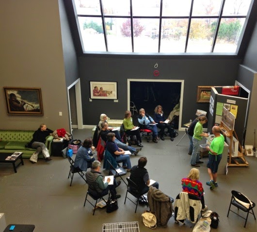
But a studio is also a place to gather and learn from other artists.Recently I had the pleasure of meeting Hai-Ou Hou at her Chesapeake Fine Art Studio in Maryland.

Christensen demo for students and visitors

I participated in a workshop and watched some amazing demos. Later I  came back and painted with Hai-ou's students who meet on Monday and Tuesday each week. The studio itself is a large open space with huge windows and rolling partitions. There's plenty of room and light.
Hai-Ou's line up of workshop teachers is impressive. So many of today's successful artists are teaching there that anyone looking for a workshop is bound to find someone they would like to study under. While students and teacher are busy in the workshop, Hai-Ou efficiently and energetically keeps everything flowing smoothly behind the scenes.

Hai-Ou also teaches workshops and holds an open studio day when she isn't painting at one of the national plein paint-out events she is so often invited to.


A corner of the studio in a rare moment of inactivity
Hai-Ou envisions Chesapeake Fine Art Studio as a space where artists can gather and paint together in an atmosphere of fun and camaraderie, while helping each other become better artists. It's also a space where art lovers can gather, watch how art is created and add new work to their collections. A perfect studio!


Hai-Ou  with students during open studio time

Sunday, November 23, 2014

Christensen Workshop Experience


I'm fresh from a 5 day Scott Christensen that was without question, the best thing I ever did for my art. I've had my eye on his workshops for a while now and as soon as I saw one I could attend on this side of the country, I jumped on it. The workshop was held at Chesapeake Fine Art Studio in Maryland. It's a beautiful large space run by Hai-ou Hou, a very accomplished artist herself, who made everything flow seamlessly throughout the week.

Maryland in November can either be Indian Summer or edge of winter. On the night before the workshop began, an arctic air mass dipping all the way down to Florida, settled in for the week. I'd brought lots of layers of warm clothing, and I needed them all to deal with the wind, rain and freezing temperatures. For those who didn't want to venture outside, the studio had floor to ceiling windows with a view of farm fields and woods.

I wasn't sure what to expect of the workshop especially since I had never attended one, but I had the advantage of knowing exactly what I was looking for to improve my work. I've also been painting long enough that I was confident I'd be able to understand the concepts that would be presented. The workshop far exceeded what I anticipated. Scott shared his knowledge and experience very generously. I'd been led to believe he could be aloof or lacking communication skills but nothing could be further from the truth. My concerns and questions were always met with precisely the right information and a genuine interest in seeing that I understood the teaching point.

I loved seeing how he worked through his idea on a constantly changing and evolving canvas, while he searched for the right combination of shape, value, color etc that best manifested the idea. Watching that approach will forever put to rest the idea that getting it right the first time is the proof of ability. I also liked his clear minded view of the current practices of plein air painting.

By the end of the workshop I was filled with such a wealth of valuable information that I have plenty to work with for a while. I have a new tool kit that I'm excited to play with!


Sunday, November 9, 2014

It's Finally Here!

 Dune Flowers on Santa Rosa Island ©Theresa Grillo Laird
click here for info

A workshop I've looked forward to for months is finally here! I've kicked off this art filled week with one last Autumn painting in the dunes before heading off to Maryland. After the workshop I'll be in New Jersey for an extended stay so I especially welcomed the chance to fill my soul with the sights and sounds of another gorgeous day in the dunes, before turning to the cold and gray north.

In the evening I headed over to the Greater Gulf Coast Art Festival for a look at what other artists are doing. The fair was good this year.

Now I'm finishing up the packing and In a few days I'll be in a 5 day workshop taught by Scott Christensen where I'll be mining whatever landscape painting information he intends to share. If you aren't familiar with Christensen's work, Google his name and take a look. You won't be wasting your time. I'll do my best to not commit the workshop mistake of trying to prove that I can paint too. Watch this blog to see the experiences of the day. 

Monday, November 3, 2014

How I Make My Painting Panels


I've been asked to show how I make my painting panels. I've bought panels from several companies. The only ones I like are expensive and honestly, the painting surface is no better than what I can produce myself. Some of the panels I've purchased, are very slick which moves the paint nicely once you get used to them. Some have a surface similar to the various weaves of stretched canvas or linen. Some have a clean looking plasticized backing. The degree of whiteness of the ground and priming can differ from brand to brand. It's worth experimenting with a few store bought brands so you know what you like and don't like. Some panels are just ground and priming on wood. These can also be made at home, but today I'll be making canvas covered panels.


 I 
The above photo shows my supplies. From a roll of primed canvas or linen, I've cut pieces to size . There are panels in various sizes, glue and a brush or roller, pieces of paper to work on and pieces of waxed paper and a kitchen rolling pin.

I cut my pieces of canvas or linen about 3/8ths or a half inch larger than the panel. The canvas will shrink a bit so you want to allow for that. Also the edges are easier to glue down if there's some overhang. I use 1/4 inch birch plywood for my panels. I get help to cut them to the sizes I need. The next step is to sand the edges a bit to remove any fuzziness or splinters.

I've tried two different kinds of glue. For me it's important to have a reversible glue. I once made a panel on Masonite and used acrylic medium to glue the canvas down. The painting then got caught in flood water. The image survived but the Masonite didn't. I couldn't detach the painting from the ruined board.
The Miracle Muck I'm currently using is reversible with heat. It's very easy to work with and sticks well. The only problem with it is that it gets moldy in it's container easily. I don't know it that's a problem in less humid parts of the country. Before trying Miracle Muck, I used Lineco Nuetral Ph Adhesive. It's reversible with water- which probably isn't ideal for a painting. It has never gone moldy in two years of being in my cabinet but doesn't stick as easily as Miracle Muck. 

As you work with your glue, your table surface will inevitably get glue on it. I use a stack of papers and change them when ever necessary to keep each new panel from getting glue on it where you don't want it. Don't use newspaper. The ink will transfer to your canvas surface.

The waxed paper is to put between your finished panels before weighting them down. I also use it to protect the canvas surface when I roll the canvas. 
Use the rolling pin is to roll all the air pockets out after you attach the canvas. I used to use an industrial type roller but this old fashioned rolling pin with it's beveled edges and larger surface, works better. 

To apply the glue, you can use a small foam paint roller which is convenient for larger panels, but you lose a lot of glue in the roller. I'm using a hardware store 3 inch wide brush in these photos.

The last thing you need is two boards to stack your glued panels between, and something to weight the stack down with. 

So, now to work! Pour glue on your panel which you've dusted clean of any sawdust or debris. Spread it evenly with a brush or roller making sure to get glue all the way to the edges. Wait a minute or so until the glued surface grabs your finger when you touch it.


Meanwhile use a sticky lint roller to get any debris off the back side of the canvas.Lay the cut pieces of canvas or linen on top of the glue carefully leaving a roughly even margin overlapping the edges. When You're happy with the placement of the canvas, lay a piece of waxed paper over it and smooth the canvas out. Take the rolling pin and roll from the center outward to perfectly adhere the canvas and to remove any air pockets. Take special care to adhere the edges well. Check the surface to make sure there are no air pockets or pieces of debris under the canvas. Debris can be removed by carefully peeling back the canvas and re-rolling it. 


Stack your glued panels on top of each other with like sizes together. I put waxed paper between them to keep any excess glue from ruining the painting surface. Weight the stack and let it dry until the next day.


probably not the best way to use a portable drawing table!

 I've been told by the makers of Miracle Muck that it isn't necessary to weight anything smaller than 30 inches. Maybe it isn't but I do it anyway to prevent bowing. With Linico glue it's absolutely necessary. Unstack your panels,  and trim the edges with a sharp razor blade and your're good to go!


Monday, October 27, 2014

A Paint-out on the Florida Panhandle

Happy artists with the day's work done, awaiting the judge's decision
Did you miss yesterday's 4th Annual Bagdad and Milton Plein Air Paint-out? We had a fantastic time. Each year this event has become bigger and better. This year it was extended to a full days paint and each participant was allowed to submit two paintings for exhibition. Also new this year, the artists could choose sites anywhere within a two town area.

75 degrees and sunny, the weather couldn't have been more perfect! 25 artists gathered at 8 in the morning to begin a day of painting. Coffee and breakfast pastries were waiting as we arrived. After getting our panels stamped, we were given a map of possible sites, a bag lunch and instructions to have our paintings back and framed by 3:30.

The Dragonfly Gallery in Milton was our center of operations for the paint out which was sponsored by the gallery and the Santa Rosa Arts and Culture Foundation. While the show was being hung, the artists and visitors were treated to very excellent music and a delicious catered lunch.


relaxing while the show was being hung


grateful to be honored with Second Place award!

Awards time brought a surprise for me. I received second place for my painting Shoreline Curve! Other winners were Christian Hemme- Best of Show, Fred Meyers- First Place, Esther Ballentine- Third Place and Jill Berry- Judges Choice.


artists and visitors enjoying the exhibit

So, what made this paint out so enjoyable?
- The sponsors went above and beyond to provide for the artist's comfort and enjoyment.
- The decision to not make the event invitational was very deliberate. The organizers
 wanted to encourage participation and create a day of fun and camaraderie.
- Everyone who participated had the chance to see their work exhibited and to gain new patrons. Though the paint- out was only one day long, the paintings will hang at the Dragonfly Gallery for more than a month.
- Plans are already underway to continue to grow and improve next year's paint-out, including the possibility of extending it to a two day event. 


My other entry-Banks of the Brook-©Theresa Grillo Laird- 9x12 oil
Do you want to join us next year? Watch for our 2015 listing in the plein air paint-outs  guide coming out in December's Plein Air Magazine.

Monday, October 20, 2014

Dream to Reality

Padres Garden - 12x16 oil on canvas panel- ©TheresaGrilloLaird
$425 - Click here to purchase

When I was a little girl of seven and already knew what I wanted to do with my life, my mother gave me a Walter Foster art instruction book. I couldn't read well enough to follow the directions but I poured over the pictures. I spent a lot of time staring into a painting of a desert scene with cactus. The colors were bright but pale and a sharp edged brilliant light washed over the whole scene. But the picture in the booklet that always stopped me in my tracks was a painting of a mission building. My eyes wandered down a long corridor with arched openings. Flowers and a garden under a blue sky could be seen through the archways. Everything was bathed in warm colors and sunshine. I dreamed of walking the length of that shaded corridor with it's pots of flowers.

After so many years of dreaming, I finally made it to California four years ago. Chance landed me on the central coast. One day, my explorations brought me over the Santa Lucia Mountains and into a valley. The valley is called Valley of the Oaks and it had been chosen by the Padres as the site of the third mission in the path of missions that are such an integral part of California's history. 

As I learned more about the mission, I also learned that it's in very real danger of being closed to the public unless enough funds can be raised to do an extensive earthquake retro-fit of the structure.

The above painting, Padres Garden, is the third painting I've completed of San Antonio de Padua Mission and I'm offering giclee prints of it. Go to my print site to view the category Help Save this Mission. 25% of the purchase price of any mission print will be donated to the restoration efforts. Click here to read about the mission, and here to go to my print store.

Monday, October 13, 2014

Can A Brush Make a Difference?


One of the things I really enjoy about painting is the interaction with the community of fellow artists, and the internet has made this community bigger and more widespread than ever. Recently of of my online artist friends that I haven't yet had the pleasure of meeting in person, recommended Rosemary and Co. brushes to me.

I've heard a lot about these brushes lately. You can hardly open an art magazine without seeing an ad or a story with an artist endorsing them. I never thought a brush could make much of a difference in the results of a painting even though some of them do feel better to work with. My favorite had been Raphael brushes, but somewhere down the line they made some changes I didn't like. The handles became a half inch shorter and the points of the rounds seemed to have been snipped off.

The reviews of Rosemary brushes were so glowing, especially for the "Ivory" series, that I decided to give them a try. I purchased mostly "Ivory" series with one "Chunking Bristle" and one "Master", and road tested them this past week.

Ivory are synthetic brushes with incredible snap and balance.  Usually I don't like synthetics. They split apart with the first dip into thinner. These brushes are different. They hold their point beautifully. They hold a lot of paint and dispense the paint in a more even stroke than the bristle brushes I'm used to. The rigger brush pulls a beautiful stroke without having to twist it. All the brushes are also incredibly light.
 did observe that the Ivories have just as much tendency as any synthetic to bend out of shape, when a couple of them got jammed against the end of my French Easel box. Running them under the very hot tap water I have in my house fixed the problem even though the bend was severe. I also noticed that they're easier to clean when you get all the paint out of them with thinner before washing them in brush soap. With my bristle brushes, I can get away with halfway cleaning them in thinner before washing them.

All in all I'm very pleased with them, which is something I'd never thought I'd say about a synthetic brush. This week I'll try out the bristle one, but I already know I've found my new brush source. Whether or not they make me a better artist remains to be seen.

Monday, October 6, 2014

How I Find Inspiration

the view 10 minutes from my doorstep

One look at where I live and you can see it isn't hard to find inspiration. I'm lucky enough to live in a paradise that most people only experience as a vacation. But when things start to get too routine, I draw on my other resources to renew my vision.

Books, artist interviews and marketing shows never fail to give me fresh focus. Usually the books I read are art books with big reproductions of paintings. I turn these photos in different directions to see how the paint was put down. Turning the picture sideways or upside down allows me to see the strokes, colors and arrangement of shapes without being hampered by recognizing the image on the canvas. Black and white photos are great for studying the value structure of a painting.
Lately, rather than the usual art book, I've been reading Tywla Tharp's book The Creative Habit . It's about adopting practices and thought patterns that allow creativity to flourish. 
Alyson Stanfield's book I'd Rather Be in the Studio, is another resource that could probably be considered the artists marketing bible. Her Art Biz Blog is also a rich source of material.

I really enjoy a good interview with an artist who knows their craft. Two resources I use are Linda Fisler's Art Chats and Leslie Saeta's Artists Helping Artists on Blog Talk Radio. Linda's show doesn't air very often,but she gets top notch artists on her program. Leslie's weekly show features an artist, or focuses marketing information or studio tips. Leslie is an excellent interviewer leaving her gust lots of breathing room to express their ideas. Both programs are good. If I can gain one bit of information I didn't know before that will help my work, I fell like my time was well spent.

Just off the easel this week is a 12x16 oil called Padres Garden. Contact me here for more information about it.


Padre's Garden - © Theresa Grillo Laird - 12x16 oil - $425  


Related Posts Plugin for WordPress, Blogger...